LATAM Web Check-in
Client: LATAM Airlines | Project: Check-in | Year: 2017
Improving the online Check-in experience
Problem to solve
The current online check-in process had usability and navigation issues that were not helping to achieve the objectives for the product and business KPIs.
On that point we only had a vague feeling and thoughts about these constraints and neither we had a plan nor a starting point to fix these issues.
So in simple words the challenge was to:
1. Discover and define the main issues.
2. Create a plan to solve them.
3. Design to solve.
4. Measure, test, and iterate.
Process
After planning these steps, I could participate in the first two; then I moved into another digital product within LATAM Airlines. The planning was as follows:
1. Evaluation
- User flow analysis
- Heuristic evaluation
- User feedback analysis
- KPI metrics
2. Definition
- Business-side pillars
- User-side pillars
- Prioritization matrix
- Backlog analysis and prioritization
3. Design
- Redesign user flow
- Redesign the UI
4. Measure
- KPI metrics analysis
- Analyze and iterate if needed
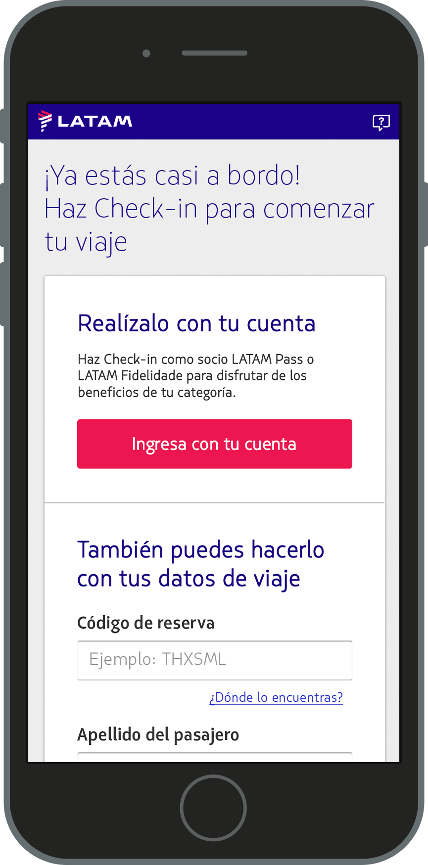
Login
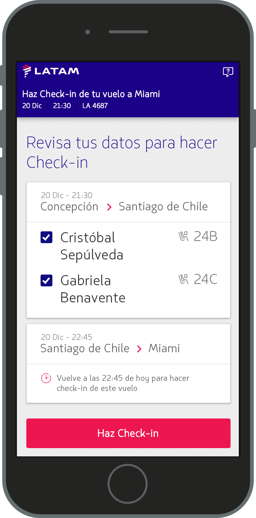
Passengers list
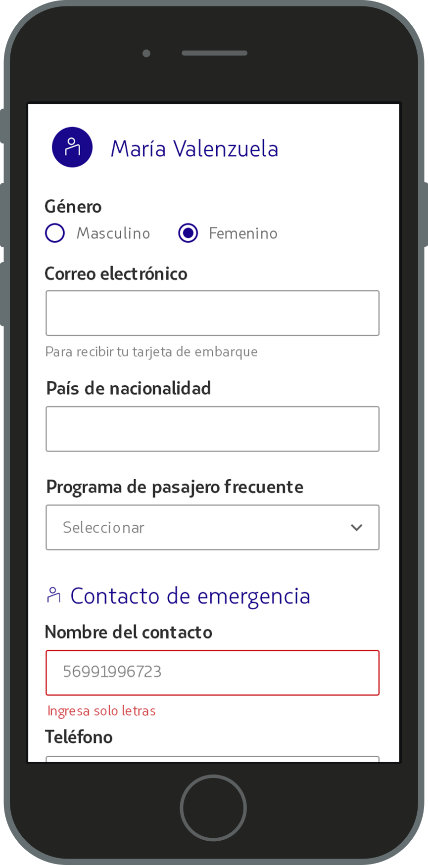
Passenger information
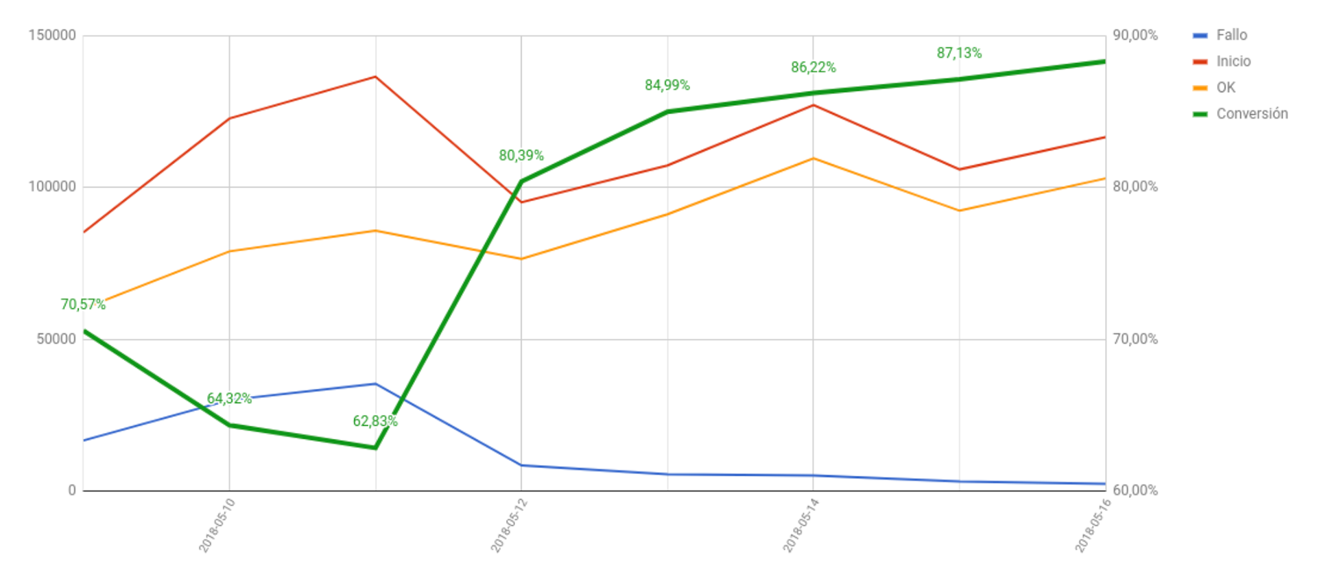
Results
Just with the usability and accessibility enhancements we could observe a 17% more conversion in the check-in user form in just a week